Mi Amor’s Café Designing a Seamless Mobile Ordering Experience
Creating a Faster, Simpler, and More Personalized Mobile ordering experience

Role
UI/UX Designer
Team
Chris Harley
(Solo)
Duration
Oct 2024
(2 mo. total)
OVERVIEW
Making orders simpler and more convenient for Mi Amor's Café.
This project, part of a UX design course, was inspired by my interest in opening a café. I focused on creating a mobile ordering app for Mi Amor's, a local café known for its pastries and Latin cuisine. With a diverse customer base, including busy professionals and tech-savvy students, the goal was to streamline the ordering process, allowing users to place orders quickly, customize their meals, and receive real-time updates for a more convenient and seamless experience.
PROBLEM STATEMENT
Solving Busy Professionals' Food Ordering Frustrations
Busy professionals need a streamlined, efficient, and personalized food ordering experience because they face challenges with inaccurate delivery times, limited customization, and poor menu navigation, which negatively impacts their ability to manage time, meal planning, and overall satisfaction. Additionally, they require real-time updates and reliable service to ensure that their orders fit seamlessly into their busy schedules without added frustration or delays.
USERS
From Fast-Paced Professionals to Café Connoisseurs
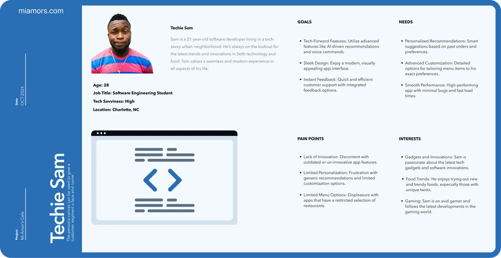
The primary users of Mi Amor's mobile ordering app include three key personas: Efficient Emma, a busy professional seeking a quick and seamless way to order meals during her lunch breaks; Student Sam, a tech-savvy college student looking for affordable, customizable meal options between classes; and Café Clara, a retiree who values simplicity and accessibility in technology.
MY ROLE
Leading the End-to-End UX Design Process
The primary users of Mi Amor's mobile ordering app include three key personas: Efficient Emma, a busy professional seeking a quick and seamless way to order meals during her lunch breaks; Student Sam, a tech-savvy college student looking for affordable, customizable meal options between classes; and Café Clara, a retiree who values simplicity and accessibility in technology.

CONSTRAINTS
Delivering a High-Fidelity Prototype in Just Eight Weeks
This project had an ambitious eight-week timeline to progress from research to high-fidelity prototypes, including usability testing. I faced challenges coordinating user interviews and testing sessions due to remote operations and the demanding schedules of participants. However, I adapted quickly, efficiently managing these constraints to keep the design process on track while swiftly incorporating valuable user feedback.
DESIGN PROCESS
Simplicity, Speed, and Customization Are the Keys to an Effortless Café Ordering Experience
During the empathize phase, I conducted interviews with a diverse group of 10 participants, including busy professionals, students, and retirees, to uncover pain points and key preferences when ordering from cafés. The interviews revealed a strong desire for a simple, fast, and reliable app with a personalized experience, while highlighting frustrations with slow performance, cluttered interfaces, and limited real-time updates. Using these insights, I created empathy maps and developed three personas—Efficient Emma, Student Sam, and Café Clara—to guide the design process and ensure the app addressed specific user needs.

Busy Professional Bryan
- • The app’s slow performance makes it hard to order quickly'
- • The checkout process is so complicated; it takes too long to place an order.
- • The app’s navigation is confusing, and finding what I want is difficult. I just want that app to be fast and simple to use.

Family-Focused Fiona
- • I need better filtering options for my dietary needs.
- • I often host events and need the option to schedule orders in advance.
- • I find that current apps lack of family meal options make it difficult to order for my family especially on a budget.
Fast, Convenient, and Seamless Ordering for Every Café Customer
In the define phase, I created user stories to ensure every feature aligned with our personas' needs, such as fast, customizable ordering for busy professionals. I also defined the 5W’s and How to clarify the app’s purpose, and hypothesized that a streamlined interface and quicker checkout would lead to greater user satisfaction. With a clear goal of providing a seamless, efficient ordering experience, the app offers fast, customizable orders and real-time updates, tailored to Mi Amor’s diverse customer base.
Busy Professional Brian
As a busy marketing manager, Brian wants to quickly place food orders using an intuitive mobile app so that he can save time during his hectic workdays. He needs real-time delivery tracking to manage his schedule effectively and ensure that his food arrives on time. Brian also desires a diverse menu that offers quick meal options that fit his ever-changing tastes.
Family-Focused Fiona
As a stay-at-home mom managing a busy household, Fiona wants an easy-to-use mobile food ordering app that allows her to find family-friendly restaurants and affordable meal options. She needs simple customization options to cater to her family's diverse preferences and reliable customer support in case of any issues with her orders.
Turning Competitor Weaknesses into a Personalized, Efficient Ordering Experience
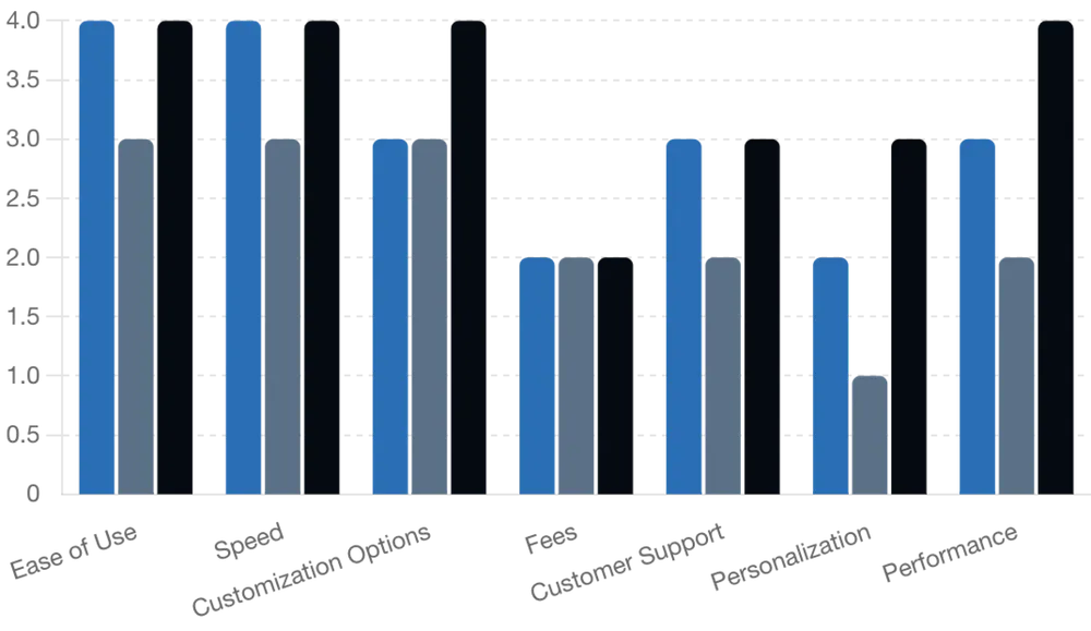
In the ideate phase, I conducted a competitive audit of Uber Eats, Grubhub, and DoorDash, identifying strong customization features but noting cluttered interfaces, slow performance, and a lack of personalization. This led to key "How Might We" questions, such as improving speed and providing a personalized experience, which guided our focus on streamlining the user flow and reducing steps in the ordering process. These insights drove our design improvements to create a more efficient, user-friendly app.
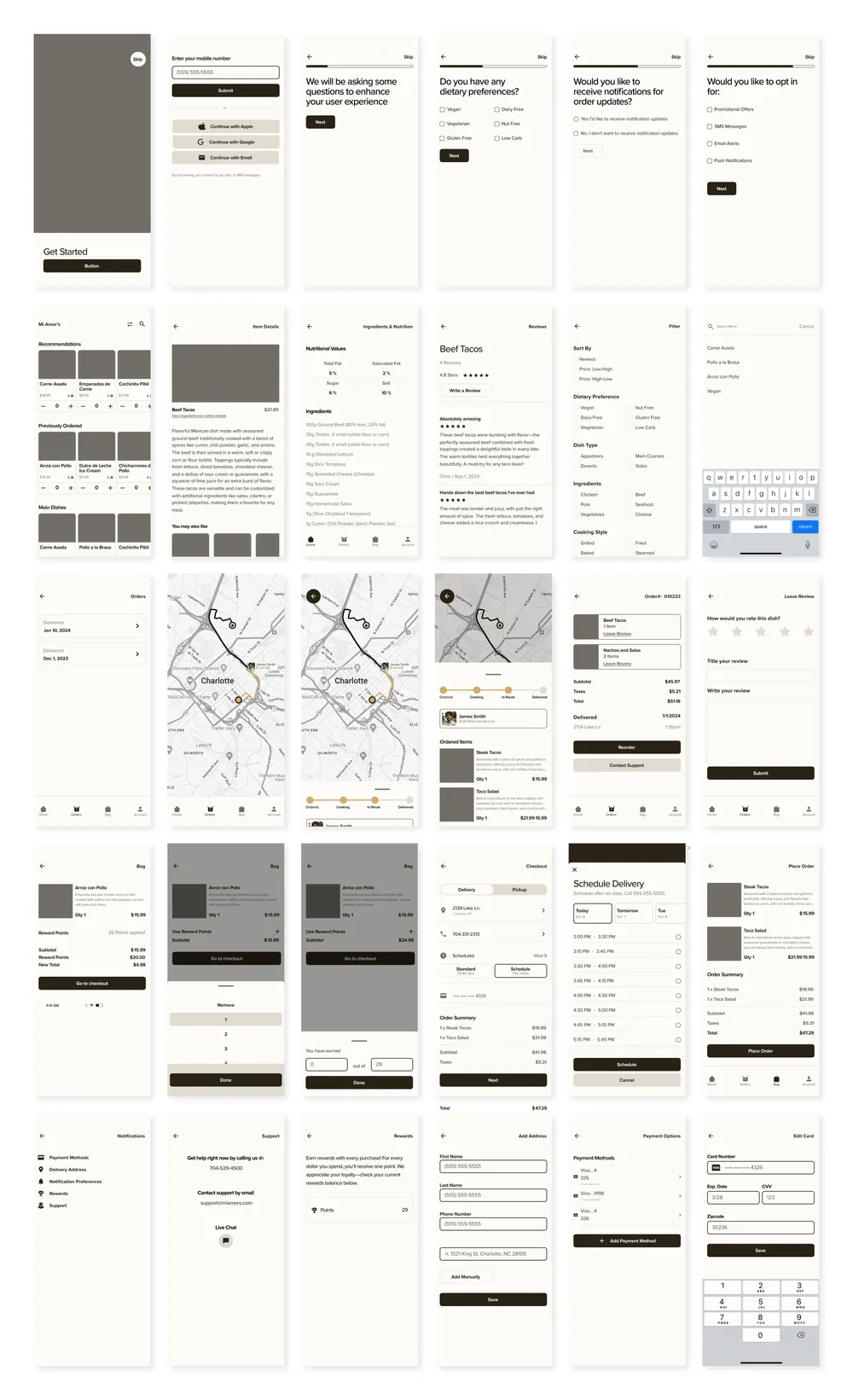
Turning Rough Ideas into a Streamlined, Personalized Café Experience
Also in the ideate phase, I created initial sketches to explore various design solutions, focusing on simplifying the user flow and enhancing customization options. These early sketches helped visualize different concepts and allowed me to quickly iterate on ideas before moving to wireframes. They served as the foundation for defining key features, such as navigation and personalized ordering.

Streamlined Flows and Intuitive Navigation for a Personalized Café Experience
In the prototype phase, I designed user flows that simplified the ordering process, allowing users to browse menus and complete checkout in just a few steps. The information architecture (IA) ensured intuitive navigation with easy access to key features like the home screen, cart, and orders. Logical menu categories, along with search and filter options, provided a seamless and personalized user experience.
Enhancing User Experience with Clear Confirmations, Visible Actions, and New Features
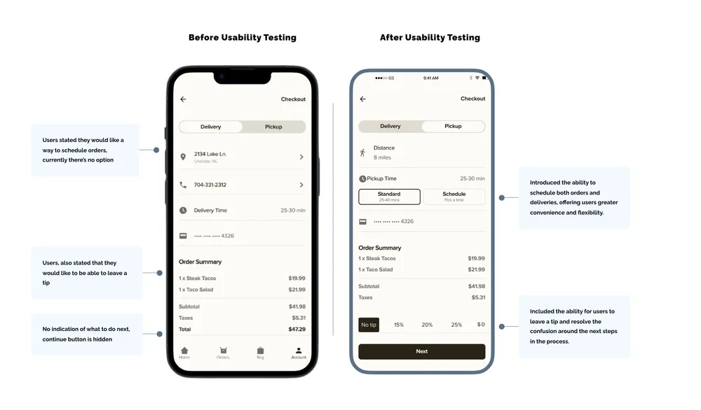
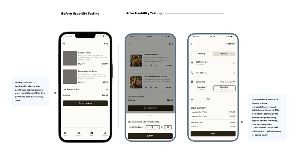
During prototype testing, usability issues like unclear reward confirmation and difficulty finding the next call-to-action button were identified and addressed with added confirmation messages and improved button visibility. Missing features, such as tip options and delivery scheduling, were added in later iterations. These improvements, along with enhanced visual feedback for cart updates, significantly improved the app's intuitiveness and user experience.
Mi Amor’s vibrant colors and clean typography blend to create a culturally inspired, seamless experience.
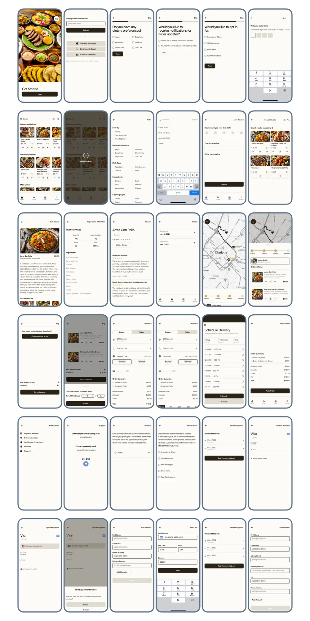
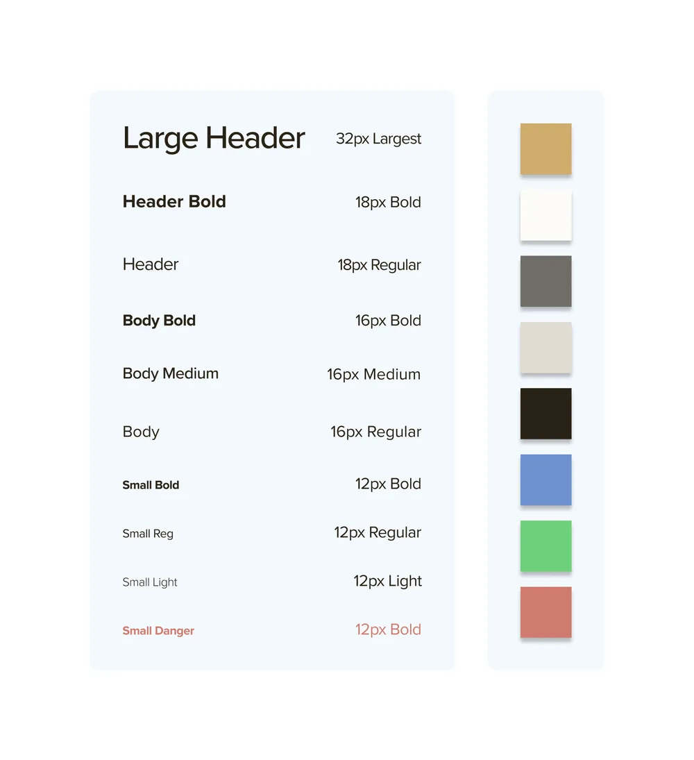
To reflect Mi Amor’s Latin American roots, I based the color scheme on the warm, earthy tone #D0AC6E, inspired by regional architecture and everyday items. All additional colors, including call-to-action elements, were chosen to complement this primary shade, with green for success and red for danger. For typography, I selected Proxima Nova, using a simple, professional approach with three font sizes and varying weights to create hierarchy and clarity.
A Minimalistic Design Delivering Real-Time Tracking, Nutritional Info, and Personalized Order Scheduling
To reflect Mi Amor’s Latin American roots, I based the color scheme on the warm, earthy tone #D0AC6E, inspired by regional architecture and everyday items. All additional colors, including call-to-action elements, were chosen to complement this primary shade, with green for success and red for danger. For typography, I selected Raleway, using a simple, professional approach with three font sizes and varying weights to create hierarchy and clarity.
